Category: Assignment 1 – Blog Posts (Page 1 of 2)

Week #11 – Active and Passive Learning

Passive and Active Learning in EDCI 337

I have really enjoyed the layout of EDCI 337 and I believe it offers an even balance of passive and active learning. Through passive learning via reading articles and watching YouTube videos, I believe this acts as the foundation to support exciting conversations about various topics with my group members every week. Additionally, I have really enjoyed the interactive components of this course by illustrating our experimentation with various tools such as H5P, Screencastify, ChatGPT, and ChatSonic onto our blog posts.

Passive and Active Learning in my Biology Classes

My biology classes mainly focus on passive learning via reading the textbook and listening to lectures. Throughout the last four years at UVIC, the design and outline of my biology classes have not changed. They always consist of a professor speaking non-stop for both 50 minute and 80 minute classes. There are very limited opportunities for students to participate in active discussions and to work on group projects. From my personal experience, I find I am more concerned about writing everything down in these lectures than actively listening to the content presented, which results in myself not actually retaining any information. It is not until I read my notes out loud at a later time when I understand the content. If I were the head of the biology department, I would ensure professors set aside class-time for students to work in groups to reflect on what has been learned previously, to solve problems, and to ask questions relating to course content.

My Experience with H5P

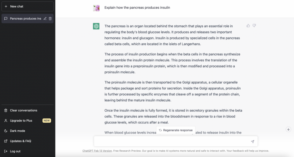
This week I had a lot of fun trying out H5P for the first time! I really enjoyed working with this tool as I have seen many interactive components like this before (i..e, drag and drop words onto images and fill in the blank questions), but did not realize they were made using H5P. I will definitely continue to use this tool on future assignments, specifically Assignment #4, as I believe this tool is extremely effective and beneficial to an individual’s learning.

First Attempt at H5P

Following the H5P tutorial, my first attempt involved the addition of text and a multiple choice question on the YouTube video I selected about how caffeine keeps us awake!

Second Attempt at H5P – Drag and Drop

Image of frog life cycle retrieved from: https://www.learnaboutnature.com/amphibians/frogs/frog-life-cycle/

Example of Scaffolding in a Learning Experience

Scaffolding is a method in which teachers first present information and illustrate how to solve a new skill or problem, and then provide an opportunity for students to try on their own or in groups. Within this technique, the teachers begin by offering a very large amount of help and support however over time the amount of support offered decreases. This method establishes confidence in the individual’s ability to complete the new skill or task. When reflecting on learning experiences in my own life, one example of scaffolding is learning a new dance skill when I took classes many years ago. At the beginning of class, my dance instructor would first demonstrate the new skill. Initially, as we tried out the skill for the first time, she would support us by performing the skill in slow-motion while we mimicked her movements. However, after a few tries, she gradually reduced her movements and then stopped performing the skill all together to provide us with the opportunity to try on our own. After trying the skill individually, we were then split into groups to continue to practice the skill with our peers. I believe this learning method is extremely effective based off my experiences and I feel that this method did promote confidence in my ability to successfully perform the dance skill.

Week #10 – Evaluating Multimedia

What is the TPACK Model?

TPACK stands for technological, pedagogical, and content knowledge. It is a framework that allows teachers to understand how these categories connect to one another in order to effectively teach students using technology. To enhance an individual’s learning, TPACK reflects on the educator’s expertise, teaching methods, and use of technology. The content knowledge consists of topics, concepts, facts, and theories. Pedagogical knowledge includes assignments and assessments. Technological knowledge refers to how technology is incorporated into learning lessons and the quality of technological tools (ie., apps and websites) that students can access. The intersections of these three main categories consist of technological-pedagogical knowledge, technological-content knowledge, and pedagogical-content knowledge.

Applying TPACK Model to the Life Cycle of a Butterfly Science Lesson

In week 7, I created a grade two science lesson on the life cycle of a butterfly and I thought it would be beneficial to my learning by taking the lesson I created and applying the TPACK model.

  • Technological Knowledge
    • Students will watch the YouTube video, The Life Cycle of a Butterfly by ClickView
  • Pedagogical Knowledge
    • Matching cards activity where students match the title of each phase of the life cycle to a small explanation describing what occurs during that stage
    • Multiple choice test
    • Group presentation
  • Content Knowledge
    • Instructor presents knowledge of each phase of the life cycle during field trip to Victoria Butterfly Gardens
    • Instructor helps students identify each phase of the life cycle using their own knowledge
  • Technological-content knowledge
    • Instructor adds one YouTube video to the lesson plan because it provides another way of information to be presented to students to influence their learning
  • Pedagogical-content knowledge
    • By the instructor creating multiple assignments and assessments, students have many opportunities to showcase their knowledge and understanding of the topic
  • Technological-pedagogoical knowledge
    • The YouTube video, The Life Cycle of a Butterfly by ClickView, is appropriate to the development of the lesson

What is the SECTIONS Model?

SECTIONS stands for:

  • Students
  • Ease of use
  • Cost/time
  • Teaching media
  • Interaction
  • Organizational issues
  • Networking
  • Security and privacy

When choosing between media and multimedia tools, this method speeds up the often intuitive process by making it more analytical.

Applying SECTIONS model to Khan Academy

I used Khan Academy a lot in high school and found it extremely helpful so I thought it would be interesting to apply the SECTIONS model to this online educational tool.

  • Students
    • Students within grades K-12 can benefit from this platform
    • Tool is limited to those who have access to the internet
  • Ease of Use
    • This online tool is very simple and easy to use
    • Does not require any skills or training
  • Cost/time
    • FREE!
    • Self-paced – students can spend however long they need to learn a specific topic
  • Teaching media
    • This tool provides a series of YouTube videos on each topic to learn the content
    • Contains practice questions to test your understanding and knowledge
  • Interaction
    • Students have the option to decide how they would like to interact with the tool (i.e., watch videos, complete practice questions, or read about the concept/topic)
  • Organizational issues
    • Can access this tool through any institution such as a schools and libraries that contain a computer and have access to the internet
  • Networking
    • Can widen the number of people in this course through use of tool
    • Individuals can work on their own or in groups on lessons and answering practice questions
  • Security and privacy

Example of Khan Academy Lesson (Fractions)

https://www.khanacademy.org/math/cc-third-grade-math/imp-fractions/imp-fractions-intro/v/cutting-shapes-into-equal-parts

Week #9 – Storytelling

This week I had a lot of fun using images gathered from DALL-E to create a storyboard!

My Storyboard and Script:

After learning about AI tools from week eight, I was eager to experiment further with DALL-E. I found this tool to be very easy to use and it was extremely effective at finding the exact images I was looking for based on the prompt I searched for.

Storytelling Techniques

From this week’s reading, 7 Storytelling Techniques Used by the Most Inspiring TED Presenters, I identify various storytelling techniques utilized by Dananjaya Hettiarachchi’s  winning speech, “I See Something” (2014). I found this presenter to be the most compelling because he is very funny and I really enjoy the tone of his voice throughout his speech!

Storytelling techniques Dananjaya Hettiarachchi Utilized:

  • Immerse your audience in the story
    • Through humour, metaphors, and allowing the audience to participate, he effectively immerses the audience into his story.
  • Tell a personal story
    • Shares personal details about his own life, which allows the audience to connect with him on a deeper level
    • By sharing personal details, the audience can relate these stories and information to their own life.
  • Creates Suspense
    • When Dananjaya picks the petals of the rose one by one and eventually throws the flower into the trash can, the audience becomes captivated to learn more.
  • Bring characters to life
    • Whenever Dananjaya talks about his mom or dad, he transports the audience to the scene which allows us to visualize and hear the characters.
  • Show, don’t tell
    • At the start of his presentation, he compares a flower to humans, and uses the removal of each petal to convey a message about being broken.
  • End with a positive takeaway
    • The speech ends with a reminder that despite how broken or lost you may feel, there will always be people in your life who will support and help you.

Week #8 – Artificial Intelligence

This week I examined Generative Artificial Intelligence, also referred to as AI, tools (i.e., ChatGPT, Quillbot, and ChatSonic) which have become increasingly popular in recent years. While AI tools can improve and support the learning of students, there are many concerns and issues regarding the ethics and accuracy of these tools.

My thoughts on this week’s readings:

As shown below, I wanted to share my thoughts and opinions on two of the readings this week that particularly stood out to me.

I found the reading by Bruff (2023) to be very eye opening in terms of the significance of educating students about how Generative Artificial Intelligence tools function and how these tools raise issues about the accuracy of generated information. The image of the character Paddington Bear on the beach showcases how easy it is for the AI image generator tool to create false yet very real-looking images. It was also very interesting to learn that a significant amount of the information on ChatGPT is retrieved from reddit posts, which raises concerns about the reliability and accuracy of the data this tool provides. Therefore, it is very important to inform students of how these tools gather information.

I very much agree with the concern that individuals can claim ownership for information they retrieved from large language models as suggested in the reading “Tools such as ChatGPT threaten transparent science; here are our ground rules for their use.” This is very problematic and so the reading suggests that regulations must be put in place to prevent false ownership from occurring. The regulations state that large language models should not be acknowledged as an author on scientific reports and that large language model tools must be referenced. I agree with these rules because I think it is extremely important for individuals to take ownership of their own work and if using information from AI sources, it must be credited.

My experience experimenting with Quillbot, ChatGPT, and ChatSonic:

Wallpaper image retrieved from ChatSonic

I have never used ChatSonic before but had a lot of fun making a wallpaper! The prompt I searched for was “create an HD wallpaper with an ocean and sea stars on the sand.”

ChatGPT is also very unfamiliar to me as I have never used this tool before. I searched “explain how the pancreas produces insulin” because I am currently learning about this topic in one of my biology classes. I was curious to see how the information provided by this tool would differ from what I have learned in class. However, after reading through the content provided by this tool, it is actually very similar to what I was taught in class.

Image retrieved from Quillbot

I copied and pasted the first two sentences of the information provided by ChatGPT on how insulin is produced by the pancreas into Quillbot. I am familiar with this tool and do find it useful while reading complex research papers to rephrase certain parts of the article that I find confusing. It can be beneficial to read sentences in a different format to better understand the meaning.

Reflection Questions

  • Have you used AI applications before? If you have, what have you used them for? What apps have you come across that are not in the Explore section that you’ve found useful?
    • I have used AI applications before such as Quillbot and Duolingo. I specifically find Duolingo to be extremely useful at helping me to remember Greek that I have learned previously. I went to Greek school for 10 years but have forgotten a lot of words that I used to know. Duolingo has been great at rekindling my forgotten knowledge!
  • What guidelines do you think should be in place to guide their use in an educational institution? What factors should be considered?
    • All AI tools used must be referenced on projects, assignments, and papers (Bruff, 2023).
    • AI tools cannot be acknowledged as an author on research reports (Bruff, 2023).
    • I think the accuracy and reliability of AI tools need to be considered. Professors should restrict the range of AI tools students can access when completing certain assignments to reduce potential bias, discrimination, and inaccuracy of information.
  • What ethical concerns do you have about the use of some of these tools?
    • I am very concerned about bias and discrimination within these tools as they may favour some information over others.
    • There are also privacy and security issues with these tools as companies may collect and gather the data inputed by users. Additionally, I have privacy concerns because users are required to give personal information when accessing these tools such as their name and email.

References

Bruff, D. (2023, March 14). Three things to know about AI tools and teaching. Agile Learning. 

Week #6 – Instructional Design and Lesson Planning

This week I learned about various instructional design techniques such as constructive alignment and backwards design that will effectively support the learning of students. Constructive alignment is the combination of two principles: alignment and constructivism. Alignment refers to the consistent relationship between what content the students will learn, how this information is taught by teachers, and how students will be assessed. Constructivism within this instructional design refers to the notion that students develop knowledge instead of having it conveyed to them by teachers. Backwards design is when you begin with your desired results, followed by a plan for how to measure those results, and then develop activities to prepare students for evaluations. As shown below, I have created a grade 2 science lesson regarding the metamorphic life cycle of a butterfly utilizing constructive alignment and Merill’s five principles of instructional design.

Example of Constructive Alignment:

My Science Lesson:

Learning outcomes retrieved from BC Curriculum – Science 2.

Merril’s Five Principles Applied to Grade 2 Science Lesson

  • Learner is engaged in solving real-world problems
    • The real-world problem in this Grade 2 science lesson is “what is the metamorphic life cycle of a butterfly?”
    • Begin lesson with an overview of the topic and an outline for what will be learned.
  • Students will activate prior knowledge and experiences to promote learning
  • Instruction demonstrates new knowledge to learners
    • Presentation created by the instructor on the definition of metamorphosis and the different phases of a butterfly’s life cycle.
    • Through a field-trip to Victoria Butterfly Gardens, students will have the opportunity to observe butterflies in their different stages of life in real-time. Instructors will create a work sheet that students can fill out while observing the butterflies to make connections to course content. It is important for students to learn outside of the classroom which offers a more hands-on and immersive experience.
  • Learners apply new knowledge to solve problems
    • Through a card game activity created by the instructor, students are asked to match the description of each phase of the life cycle to the correct term.
    • Students will work in groups of two to create a presentation describing each phase of the life cycle in their own words.
    • A short multiple choice test will evaluate the student’s understanding of concepts learned in class. Students will first complete the test on their own and then compare their in groups of four.
  • Learners integrate new knowledge into their everyday life
    • Students should be able to make connections to other living organisms such as a frog that also undergo metamorphosis.
    • Students should recognize that every living organism has a life cycle and why it is important.

Constructive Alignment and Backwards Design in my Courses:

When reflecting on my own learning, I believe the majority of my biology classes somewhat use a backwards and constructive alignment approach however this need to be significantly improved in the future. For instance, when starting a new topic my professors always begin with a slide talking about the learning outcomes and what students are expected to know by the end of the topic. However, this is always followed by a series of lectures and examinations. The information within these biology classes are conveyed directly to students from teachers through lectures and there are no opportunities for students to develop the knowledge on their own. In addition, my professors do not develop activities to prepare students for examinations or find new ways to measure our learning as course content is always depicted through lectures and we are always tested on content through exams.

Resources

Merrill, M. D. (2002). First Principles of Instruction. ETR&D, 50, 3. pp. 43-59.

Week #5 – Utilizing Design Principles with Infographics

This week I had a lot of fun making an infographic using Canva. I have used Canva several times for other classes and I believe it is a very effective tool at combining text and images to display a message.

What makes a good infographic?

A good infographic is an effective infographic, which are well-designed, easy to follow and understand, and tell a story (Visme, 2017).

The infographic I made:

Design principles within my infographic

  • Alignment ensures the arrangement of the design is captivating, organized, and connected (Adobe, 2020). I utilized this principle in my design as I focused on symmetry with my images within the five steps and did my best to make sure they were of somewhat similar size. I also focussed on text symmetry and made sure they were aligned similarly.
  • Hierarchy puts forth the idea that when there are various images, the most important images containing an important message should stand out (Adobe, 2020). In my infographic, I increased the size of writing for the title and headers and bolded them to help focus the attention of viewers.
  • Repetition refers to repeating colours, fonts, and shapes to make the format more visually appealing (Adobe, 2020). I have incorporated the repetition of fonts and colours throughout my infographic.
  • Proximity refers to the grouping of related components to benefit the structure and organization of the design (Adobe, 2020). I categorized my infographic into five components as shown by the green to white colour patterns.
  • Negative space is purposefully leaving blank space within the design to assist in emphasizing the most important information (Adobe, 2020). I ensured there was negative space within my infographic because I find the combination of too many words and images overwhelming.

Resources

Adobe (2020). 8 basic design principles to help you make awesome graphics. Adobe Express. Retrieved from: https://www.adobe.com/express/learn/blog/8-basic-design-principles-to-help-you-create-better-graphics 

Visme (2017). How to Create an Infographic – Part 1: What makes a good infographic? Retrieved from: https://www.youtube.com/watch?v=nLxQAa5Sras

Week #4 – Inclusive Design

This past week I examined the role of accessibility and inclusion in education to gain a better understanding of what it is and how it can be beneficial. Through an online tool known as WAVE , I explored how accessible and inclusive my previous blog post was. After receiving the results, I found myself to be very surprised! Additionally, I explored Read Aloud, an online tool that converts text to speech.

What is inclusive design?

Inclusive design works to “provide the best user experience for as many people as possible” (Sehl, 2020). By providing a variety of options for individuals to engage and interact with, inclusive design ensures that all individuals have equal access to various opportunities that support their education (Sehl, 2020).

What does inclusive design mean to me?

When I think of inclusive design, I think of tools that allow all individuals, including those with learning disabilities or hearing loss, the ability to experience equal learning opportunities. In addition, I believe it is important for everyone to have access to the same educational resources, regardless of their background, gender, race, or culture.

What type of learners does inclusive design benefit?

  • Individuals with learning disabilities
  • Those with hearing loss/deaf
  • Anyone with vision impairment
  • Foreign learners
  • Any individual with special needs

EVERYONE CAN BENEFIT!!

My experience using WAVE on my previous blog post

After running the WAVE accessibility report on my previous blog post, I was very surprised to see the amount of errors I had made! I have attached two images below showcasing my summary report on WAVE and features on my post that have been flagged. I mainly faced contrast errors because the contrast of my blog post was not fitting for people with vision impairments. In addition, my links were not placed properly within my text and I did not include alternative text for my images. The WAVE accessibility report allowed me to better understand the requirements for inclusive design and what needs to be changed in my future posts to ensure easy access for all individuals.

My experience with Read Aloud

I have never used text to speech tools before and found Read Aloud extremely useful! During exam-heavy weeks, I become really exhausted and have difficulty staying focussed on the content I am reading. As a result, I often find myself reading over text multiple times in attempt to understand the message being conveyed. However, this tool allowed me to read and listen to the material simultaneously, which improved my concentration. I will continue to use this tool in the future when studying for exams!

Resources

Read Aloud: A text to Speech Voice Reader – Chrome extension

Sehl, K. (2020). Inclusive Design for Social Media: Tips for Creating Accessible Channels. Retrieved from: https://blog.hootsuite.com/inclusive-design-social-media/

WAVE Chrome, Firefox, and Edge Extensions (webaim.org) â€“ WAVE accessibility checker for the web

Week #3 – Sketchnoting!

My Experience with Sketchnoting

This week I tried out sketchnoting for one of my biology lectures while we talked about an overview of the endocrine system and the various key hormones that different endocrine glands secrete. While listening to the lecture, I focussed my attention on the most important concepts and ideas as well as key words.

The difficulty I experienced while sketchnoting was that because my professor spoke quite fast, I found it difficult to keep up with the speed of the lecture as I sketched and wrote down important concepts simultaneously. As a result, I believe I may have missed some information from the lecture simply because I was sketchnoting at a much slower rate than the presentation itself. However, I found this technique to be very beneficial for my concentration. I normally get distracted with my thoughts during lectures and tend to think about other things, but sketchnoting was really great at helping me to focus on the task at hand.

Mayer’s Principles and Intrinsic Load

The segmenting principle (categorizing/chunking concepts), modality principle (graphics and narration instead of graphics or narration), and pretraining principle (overview first, details later) are three of Mayer’s principles useful for managing intrinsic load. While creating my scetchnote, I found it very useful to categorize the various endocrine glands into different sections. For pretraining, I found Doug Neil’s tutorial on how to sketchnote without drawing very informative and I watched this tutorial before creating my own scetchnote in class. However, I had trouble incorporating the modality principle into my sketchnote. I believe it would be beneficial to upload a less text-heavy sketchnote onto Microsoft PowerPoint and use the audio feature to record an explanation of the content. I will keep this principle in mind as I continue to make more sketchnotes in the future!

Sketchnote Images for Inspiration

Week #2 – Mayer’s Principles and Screencasting

Microsoft PowerPoint is a great tool that can be used in a collaborative environment!

This week I created a screencast via Screencastify of a quick Microsoft PowerPoint tutorial. As shown below, in my tutorial, I explain some unique features of Microsoft PowerPoint and how to share the presentation with peers to collaborate in group-settings. This is an awesome tool to use in both an educational and professional setting.

Mayer’s Principles

The redundancy principle is one of Mayer’s principles that I included in my screencast tutorial. This principle teaches us that adding multiple visuals, text, and narration at once can be overwhelming and so it is important to be critical about what is included to ensure it is not distracting. I accomplished this in my tutorial by adding one image of the Carbon Cycle to enhance the message I was trying to convey without being too distracting.

I also did my best to keep the coherence principle in mind while creating my screencast. This principle stresses the importance of only focusing on content that is the most important and to avoid/eliminate adding any overwhelming or unnecessary content. Although there is a lot to be said on how to use Microsoft Powerpoint, I did my best to achieve this principle by only explaining some of the most important features such as to how to add another slide in the presentation, how to share this presentation with peers, and how to add pictures.

The signaling principle is one principle that I had trouble incorporating into my screencast. This principle suggests the importance of visual cues and introductory sentences to assist the viewer in processing content. After re-watching my tutorial, I think it would have been helpful to highlight specific categories as a visual cue to assist viewers on where to look while explaining different aspects of the app. I will be sure to keep this principle in mind when creating future media for this course!

Microsoft Powerpoint Screencast Tutorial:

https://youtu.be/81BLOFxryEI

Note: I accidentally said “select” instead of “insert” when explaining how to attach a picture to a presentation slide.

« Older posts

© 2024 EDCI 337

Theme by Anders NorenUp ↑