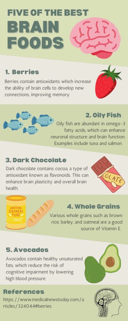
This week I had a lot of fun making an infographic using Canva. I have used Canva several times for other classes and I believe it is a very effective tool at combining text and images to display a message.
What makes a good infographic?
A good infographic is an effective infographic, which are well-designed, easy to follow and understand, and tell a story (Visme, 2017).
The infographic I made:

Design principles within my infographic
- Alignment ensures the arrangement of the design is captivating, organized, and connected (Adobe, 2020). I utilized this principle in my design as I focused on symmetry with my images within the five steps and did my best to make sure they were of somewhat similar size. I also focussed on text symmetry and made sure they were aligned similarly.
- Hierarchy puts forth the idea that when there are various images, the most important images containing an important message should stand out (Adobe, 2020). In my infographic, I increased the size of writing for the title and headers and bolded them to help focus the attention of viewers.
- Repetition refers to repeating colours, fonts, and shapes to make the format more visually appealing (Adobe, 2020). I have incorporated the repetition of fonts and colours throughout my infographic.
- Proximity refers to the grouping of related components to benefit the structure and organization of the design (Adobe, 2020). I categorized my infographic into five components as shown by the green to white colour patterns.
- Negative space is purposefully leaving blank space within the design to assist in emphasizing the most important information (Adobe, 2020). I ensured there was negative space within my infographic because I find the combination of too many words and images overwhelming.
Resources
Adobe (2020). 8 basic design principles to help you make awesome graphics. Adobe Express. Retrieved from: https://www.adobe.com/express/learn/blog/8-basic-design-principles-to-help-you-create-better-graphics
Visme (2017). How to Create an Infographic – Part 1: What makes a good infographic? Retrieved from: https://www.youtube.com/watch?v=nLxQAa5Sras
Leave a Reply
You must be logged in to post a comment.