Month: February 2023

Week #5 – Utilizing Design Principles with Infographics

This week I had a lot of fun making an infographic using Canva. I have used Canva several times for other classes and I believe it is a very effective tool at combining text and images to display a message.

What makes a good infographic?

A good infographic is an effective infographic, which are well-designed, easy to follow and understand, and tell a story (Visme, 2017).

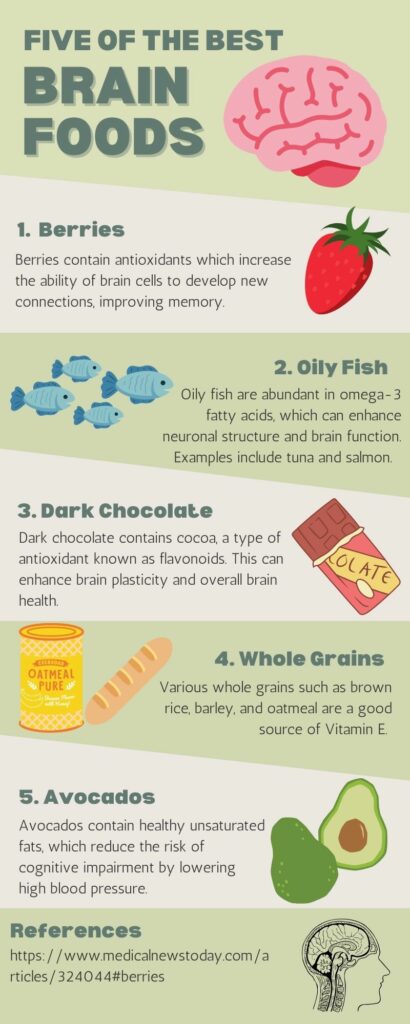
The infographic I made:

Design principles within my infographic

  • Alignment ensures the arrangement of the design is captivating, organized, and connected (Adobe, 2020). I utilized this principle in my design as I focused on symmetry with my images within the five steps and did my best to make sure they were of somewhat similar size. I also focussed on text symmetry and made sure they were aligned similarly.
  • Hierarchy puts forth the idea that when there are various images, the most important images containing an important message should stand out (Adobe, 2020). In my infographic, I increased the size of writing for the title and headers and bolded them to help focus the attention of viewers.
  • Repetition refers to repeating colours, fonts, and shapes to make the format more visually appealing (Adobe, 2020). I have incorporated the repetition of fonts and colours throughout my infographic.
  • Proximity refers to the grouping of related components to benefit the structure and organization of the design (Adobe, 2020). I categorized my infographic into five components as shown by the green to white colour patterns.
  • Negative space is purposefully leaving blank space within the design to assist in emphasizing the most important information (Adobe, 2020). I ensured there was negative space within my infographic because I find the combination of too many words and images overwhelming.

Resources

Adobe (2020). 8 basic design principles to help you make awesome graphics. Adobe Express. Retrieved from: https://www.adobe.com/express/learn/blog/8-basic-design-principles-to-help-you-create-better-graphics 

Visme (2017). How to Create an Infographic – Part 1: What makes a good infographic? Retrieved from: https://www.youtube.com/watch?v=nLxQAa5Sras

Week #4 – Inclusive Design

This past week I examined the role of accessibility and inclusion in education to gain a better understanding of what it is and how it can be beneficial. Through an online tool known as WAVE , I explored how accessible and inclusive my previous blog post was. After receiving the results, I found myself to be very surprised! Additionally, I explored Read Aloud, an online tool that converts text to speech.

What is inclusive design?

Inclusive design works to “provide the best user experience for as many people as possible” (Sehl, 2020). By providing a variety of options for individuals to engage and interact with, inclusive design ensures that all individuals have equal access to various opportunities that support their education (Sehl, 2020).

What does inclusive design mean to me?

When I think of inclusive design, I think of tools that allow all individuals, including those with learning disabilities or hearing loss, the ability to experience equal learning opportunities. In addition, I believe it is important for everyone to have access to the same educational resources, regardless of their background, gender, race, or culture.

What type of learners does inclusive design benefit?

  • Individuals with learning disabilities
  • Those with hearing loss/deaf
  • Anyone with vision impairment
  • Foreign learners
  • Any individual with special needs

EVERYONE CAN BENEFIT!!

My experience using WAVE on my previous blog post

After running the WAVE accessibility report on my previous blog post, I was very surprised to see the amount of errors I had made! I have attached two images below showcasing my summary report on WAVE and features on my post that have been flagged. I mainly faced contrast errors because the contrast of my blog post was not fitting for people with vision impairments. In addition, my links were not placed properly within my text and I did not include alternative text for my images. The WAVE accessibility report allowed me to better understand the requirements for inclusive design and what needs to be changed in my future posts to ensure easy access for all individuals.

My experience with Read Aloud

I have never used text to speech tools before and found Read Aloud extremely useful! During exam-heavy weeks, I become really exhausted and have difficulty staying focussed on the content I am reading. As a result, I often find myself reading over text multiple times in attempt to understand the message being conveyed. However, this tool allowed me to read and listen to the material simultaneously, which improved my concentration. I will continue to use this tool in the future when studying for exams!

Resources

Read Aloud: A text to Speech Voice Reader – Chrome extension

Sehl, K. (2020). Inclusive Design for Social Media: Tips for Creating Accessible Channels. Retrieved from: https://blog.hootsuite.com/inclusive-design-social-media/

WAVE Chrome, Firefox, and Edge Extensions (webaim.org) – WAVE accessibility checker for the web

Week #3 – Sketchnoting!

My Experience with Sketchnoting

This week I tried out sketchnoting for one of my biology lectures while we talked about an overview of the endocrine system and the various key hormones that different endocrine glands secrete. While listening to the lecture, I focussed my attention on the most important concepts and ideas as well as key words.

The difficulty I experienced while sketchnoting was that because my professor spoke quite fast, I found it difficult to keep up with the speed of the lecture as I sketched and wrote down important concepts simultaneously. As a result, I believe I may have missed some information from the lecture simply because I was sketchnoting at a much slower rate than the presentation itself. However, I found this technique to be very beneficial for my concentration. I normally get distracted with my thoughts during lectures and tend to think about other things, but sketchnoting was really great at helping me to focus on the task at hand.

Mayer’s Principles and Intrinsic Load

The segmenting principle (categorizing/chunking concepts), modality principle (graphics and narration instead of graphics or narration), and pretraining principle (overview first, details later) are three of Mayer’s principles useful for managing intrinsic load. While creating my scetchnote, I found it very useful to categorize the various endocrine glands into different sections. For pretraining, I found Doug Neil’s tutorial on how to sketchnote without drawing very informative and I watched this tutorial before creating my own scetchnote in class. However, I had trouble incorporating the modality principle into my sketchnote. I believe it would be beneficial to upload a less text-heavy sketchnote onto Microsoft PowerPoint and use the audio feature to record an explanation of the content. I will keep this principle in mind as I continue to make more sketchnotes in the future!

Sketchnote Images for Inspiration

Week #2 – Mayer’s Principles and Screencasting

Microsoft PowerPoint is a great tool that can be used in a collaborative environment!

This week I created a screencast via Screencastify of a quick Microsoft PowerPoint tutorial. As shown below, in my tutorial, I explain some unique features of Microsoft PowerPoint and how to share the presentation with peers to collaborate in group-settings. This is an awesome tool to use in both an educational and professional setting.

Mayer’s Principles

The redundancy principle is one of Mayer’s principles that I included in my screencast tutorial. This principle teaches us that adding multiple visuals, text, and narration at once can be overwhelming and so it is important to be critical about what is included to ensure it is not distracting. I accomplished this in my tutorial by adding one image of the Carbon Cycle to enhance the message I was trying to convey without being too distracting.

I also did my best to keep the coherence principle in mind while creating my screencast. This principle stresses the importance of only focusing on content that is the most important and to avoid/eliminate adding any overwhelming or unnecessary content. Although there is a lot to be said on how to use Microsoft Powerpoint, I did my best to achieve this principle by only explaining some of the most important features such as to how to add another slide in the presentation, how to share this presentation with peers, and how to add pictures.

The signaling principle is one principle that I had trouble incorporating into my screencast. This principle suggests the importance of visual cues and introductory sentences to assist the viewer in processing content. After re-watching my tutorial, I think it would have been helpful to highlight specific categories as a visual cue to assist viewers on where to look while explaining different aspects of the app. I will be sure to keep this principle in mind when creating future media for this course!

Microsoft Powerpoint Screencast Tutorial:

https://youtu.be/81BLOFxryEI

Note: I accidentally said “select” instead of “insert” when explaining how to attach a picture to a presentation slide.

© 2025 EDCI 337

Theme by Anders NorenUp ↑